
SAMSUNG
Design Proposal for Next Button Application
Overview.
Team Project
Role
Product Design · PUI Design · UX Design · User Research · Usability Testing
Mar 2024- Jun 2024
Tools
Illustration · Photoshop · Figma · Fusion 360 · Keyshot
This project explores interaction design for the AI features newly introduced in the Galaxy S24, aiming to shape user perception of the product. We proposed a refined product body design that adapts to users’ touch context and intent, creating a seamless UX loop around the touch buttons. In the PUI workshop, three concepts were developed: gesture-based interactions, enhanced AI usability, and a proactive AI relationship. I contributed by proposing the body design for the first and third concepts. In parallel, I also designed the Galaxy Bixby–AI integrated UX/UI based on users’ stages of AI adoption, with a focus on exploring how people can best adapt to the growing presence of AI in everyday life.

Design Process.
Define
The need for a body design that responds to touch intent

Unlike earlier concept designs that only reacted mechanically, there is a need for the device body to evolve into a design perspective that responds to human touch context and intention.
A touch button-centered UI/UX design that recognizes user behavior and habits

Along with enabling on-device AI functions through the touch body, the interaction of the touch button should recognize user behaviors and habits, forming a UX feedback loop that requires thoughtful design.
Goal
An Interaction-Based Design Proposal for Shaping New Perceptions of AI Phones
Product Design
Creating product designs that allow users to intuitively recognize and trust AI capabilites with new touch key
Research
Product Design Evolution: Samsung and Apple
At the beginning of the project, we conducted a comparative study of Samsung and Apple’s product design evolution. We focused on how their home and volume buttons changed over time alongside shifts in the overall form factor. This research revealed how subtle adjustments in hardware design, such as button placement, shape, and tactile feedback, communicate new technological functions to users.
By analyzing these changes, we were able to identify design strategies that make invisible functions, such as AI integration, more intuitive and noticeable through physical cues. These insights informed the direction of my own product design, where I explored how the physical form of an AI phone could clearly signal its advanced capabilities at first glance.

Study on Mobile Phone Usage Patterns
We conducted research on how people interact with smartphones in daily life, focusing on the challenges of one-handed use. Observations revealed that 49% of users operate their phones entirely with one hand, while 36% cradle the phone with one hand and interact with the other, and only 15% use both hands consistently.
This led us to analyze “unreachable zones” on the screen, where users experience discomfort or strain, especially as smartphone sizes have grown. Additionally, anthropometric data of hand dimensions highlighted differences across age and gender, reinforcing the need for ergonomic design.
By combining field observations (subway, streets, daily routines) with ergonomic data, we identified clear design opportunities for new button layouts and interaction models that better support natural, one-handed use.


Ideation Ⅰ

In the first stage of exploration, we focused on reimagining the side button as a touch-based interface. The goal was to see how this single hardware change could open new forms of interaction and expand the role of the device body itself. Rather than treating the side button as a simple on/off switch, the touchpad concept was framed as a context-aware and versatile surface. It allows users to recognize its area without looking, making interactions more intuitive and seamless in daily use. Building on this foundation, we explored how the touchpad could go beyond simple input to support one-handed operation, quick multitasking, direct AI function execution, and even integration with eye tracking.
Prototype Ⅰ
Based on this concept, a wide range of ideation sketches and explorations were generated.
The focus was on ensuring usability with one-hand operation, carefully considering the most natural positions for interaction. In addition, I explored how a touch-based side button could provide clear tactile cues by introducing reference points, helping users sense its location without visual guidance.
These directions guided the development of multiple design variations and interaction ideas.
| Clear tactile cues by introducing reference points


| One-hand operation


| Eye-tracking for one-hand operation


Usability Testing: Touchpad Layout & Gesture Preferences

Objective: To compare the usability of the Galaxy S24 with the new design and evaluate how well the new design fits actual use
Analyzed the usability of frequently used side button functions when transitioned into a touchpad, new positions, and gestures, comparing them against the Galaxy S24. (better than (+), same as (0), worth than (-)
We conducted a user testing, PUI workshop with 8 participants to explore the button’s physical configuration in more detail. The workshop focused on testing where the button should be placed, how many buttons are optimal, and how different combinations work together. Participants were asked to evaluate which button arrangements felt most natural and intuitive when performing specific functions. Through this process, we aimed to understand how users could experience the greatest comfort and efficiency when interacting with touch-based buttons.
Touchpad Position & Gesture Usability Test


We compared the Galaxy S24’s physical side buttons with newly designed touchpad versions to evaluate usability and ergonomics. The touchpad design reduced physical strain and allowed quicker, more fluid gestures, but users often struggled with positional awareness and lacked clear tactile confirmation. While the dual-sided layout improved reachability and gesture control, it highlighted the need for stronger feedback and intuitive learning for seamless interaction.
PUI Comparison Results


Existing Side Button
(Galaxy S24)
Proposed Layout (b,c,d)
-
Requires significant force to operate → causes instability in grip and shaking issues when taking photos
-
Intuitive and familiar location and usage
-
Each press operation takes longer to complete
-
Requires less finger pressure to operate ↓
-
Difficult to recognize position
-
Needs clear operational feedback
-
Fundamental need arises regarding button position and length
The result highlights how transitioning from physical side buttons to touchpad layouts reduces finger strain and improves fluidity, yet introduces challenges in positional recognition, feedback clarity, and optimal button placement.

Feedback Factors by Function
This analysis organizes physical user interface (PUI) functions based on usage frequency and feedback importance to optimize interaction. Results show that frequently used actions such as volume control, photo capture, and screenshots require immediate haptic feedback, while visual feedback alone is sufficient for actions with clear on-screen confirmation. By prioritizing haptic and visual feedback according to function complexity, the design enhances responsiveness and user confidence in touchpad-based interactions.


Dual-Sided Touchpad Gesture Usability Test
This test analyzed how users interact with left and right touchpads on a smartphone. Users preferred simple tap and press gestures on the left side (using the middle finger), mainly for basic actions like power or screenshot. In contrast, the right side, operated by the thumb, enabled more flexible swipe gestures, making it suitable for functions like volume control and page switching. Overall, extending the right touchpad length improved usability and control comfort.

Dual-Sided Touchpad Preferences Results
Through this usability experiment, it was discovered that right-side thumb gestures provide the most intuitive and efficient control. Users naturally favored gesture-based actions over physical buttons, revealing that quick gestures significantly improve interaction speed and comfort.
Design Insights: Optimizing Feedback, Position, and Gestures
User testing revealed that the right-side touchpad offers more intuitive control for swipe gestures, while the left pad works best in a centered position for simple actions. Optimizing pad length and gesture-based interaction improved comfort, accuracy, and overall usability.

Position
•The left touchpad is convenient for operation when located in the middle section.
(Awkward and difficult to use if positioned for pinky or finger taps only)
•For the left touchpad, position is more important than length (area).
•When pads are placed on both sides, there is a need for the right pad to be longer than the conventional volume button size. (To enable central use of the touchpad)
Size
•If the swipe gesture button is too long, the recognition area becomes excessively large, causing inconvenience.

Gesture
•Swipe gestures are more suitable on the right side (where the volume button is located).
(If the volume control pad were on the left side, left-hand swipe gestures would be more difficult.)
•For left swipe gestures, usage becomes awkward and difficult. (Cannot be comfortably performed as a left-handed gesture.)
•During camera usage, pressing buttons often causes shaking and discomfort. (Users prefer gestures over buttons in these situations.)
•The existing screenshot function causes inconvenience when performed with button presses.
→ Users want a new touchpad-based gesture operation.
(A necessary change to improve usability.)
The redesigned PUI achieved a 42.6% improvement in overall usability, increasing average scores from 4.7 → 6.7 / 8. Through this iteration, the design evolved toward a more intuitive, ergonomic, and feedback-rich interaction model.
Ideation & Prototype Ⅱ

Based on the PUI usability test, three design concepts were developed. Concept 1 maintains the original button positions but converts them entirely into touchpads. Concept 2 places buttons on both sides, with a dome-shaped power button on the left and a volume touchpad on the right. Concept 3 also positions buttons on both sides, with a volume touchpad on the left and a power touchpad on the right. I contributed to the product design of Concept 3.

The focus was on ensuring consistent usability and intuitive control in any orientation, whether the device is held vertically or horizontally, users can operate it comfortably with the same gestures. This provides a seamless and unified interaction experience across different usage contexts.
This design reimagines the traditional physical buttons by replacing both the volume and power keys with fully touch-based inputs on each side of the device. By introducing touch keys on both edges, the design creates an entirely new button layout and interaction method.


Additionally, engraved reference lines on the back surface guide the user’s fingers to the exact position of the touch keys, enabling effortless location and reducing the need for visual confirmation. This tactile feedback enhances discoverability and improves overall accessibility of the touch interface.
Final Concept

Through this process, three distinct concepts emerged, redefining the AI phone through gesture-based touch interactions and AI-integrated design. Concept 1 'Slick Flow' keeps the Galaxy S24 layout while replacing only the volume key with a touch pad, balancing familiarity with subtle novelty. Concept 2 'Active Interaction' relocates the power button to the left and extends the right-side touch pad for gesture-based AI activation, enabling quicker and more dynamic use of AI. Concept 3 'Tap! Galaxy is here' introduces an exclusive AI key that delivers personalized functions and emphasizes AI as the core of the device experience.

SLICK FLOW
Slick Flow explores how replacing the physical volume buttons with a touchpad can create a smoother and more intuitive interaction while maintaining the familiar button layout of the Galaxy S24.

The Integrated Flow design connects the side frame seamlessly with the recessed key area, where the upper and lower edges blend smoothly into the frame while the center area becomes sharper to define the touch zone. Using the same metal material as the frame, the buttons visually integrate into the body. The touchpad sits flush with the recessed surface, while the power button slightly protrudes, preserving a clean and aligned profile from the front view.

The Slick Brim design positions the touch keys deeper than the frame to reduce accidental touches, while smoothly connecting the frame edge to guide natural swipe gestures. A subtle height difference between the dome key and touchpad, along with a tapered curved edge, provides clear tactile feedback, allowing users to distinguish and use both keys seamlessly.
We explored ways to connect everyday experiences with the characteristics of the touch key by linking it to the rear LED lighting. This allows the touch function to be used even when the phone is placed face down, enabling convenient interactions without needing to see the screen.


A new experience where users can check notifications through LED lighting and touch keys, even when the phone is placed face-down.
LED backlight signals calls or alarms when the phone is face-down. A quick swipe-down rejects the call and fades out the light.
LED backlight indicates ongoing notifications. Users can control them instantly via touch gestures.


An alternative lighting expression to reinforce feedback, with the same gesture control.
During meetings, dimming LEDs confirm recording status. Swipe-down on the touch key to stop recording.
Another lighting variation for recording feedback, also controlled with the same gesture.

TAP!
GALAXY AI IS HERE
Tap! Galaxy AI is here is proposed to add an AI key that can actively call the AI assistant. This AI key ensures that the AI button is always accessible and consistently executes AI functions.
By operating AI functions through the AI key, various AI features can be easily managed with a single button, reducing the risk of accidental operation and allowing seamless connection with other keys.
The AI button is designed to be round and protrude from the side. A ring structure is incorporated inside the camera to reflect the identity of the AI phone, symbolizing artificial intelligence perceiving the world with intelligence.


Tap the round AI button to summon your AI assistant. When you call the AI Assistant, it will recommend suitable AI functions that align with the context of the app you are using. The AI assistant, designed like a GUI with circular buttons that appear to be looking at you, analyzes the user's behavior patterns, predicts the next action, and provides recommendations.


UI/UX Design
Integrated Assistant Experience: Galaxy Bixby × Galaxy AI
Research
To leverage the shared “call” function, we explored the integration of Galaxy Bixby and the Galaxy AI assistant. We designed a Physical User Interface (PUI) button that allows users to seamlessly summon both assistants at once.
In this project, I was responsible for designing the overall UX framework, ensuring a smooth and consistent user journey across the integrated system. I also contributed to the UI design, aligning the visual identity and interaction patterns to create a cohesive experience.
This research highlighted the complementary roles of the two systems:
-
Bixby: simplifying device use through function execution, contextual awareness, and voice interaction.
-
Galaxy AI: enabling advanced capabilities such as photo editing, summarization, translation, and search, expanding how users imagine, create, and express.
-
Together, the integration aimed to provide users with a more powerful, unified, and intuitive assistant experience.


Fragmentation in the Galaxy AI Ecosystem
The Galaxy AI ecosystem currently offers a wide range of assistive functions, including Browsing Assist, Writing Assist, Photo Assist, Call Assist, Note Assist, Record Assist, Interpreter, and Circle to Search. While each feature effectively supports specific user needs, they exist in a fragmented form without a unified structure.
This issue is most visible in the context menus, where each assist function introduces different visual styles, interaction flows, and terminology. Such inconsistencies disrupt the Look & Feel, leading to user confusion, reduced predictability, and an overall weaker experience.
To address this, a unified AI framework is required—one that standardizes UI/UX principles across all assistive functions to deliver a seamless, coherent, and predictable user experience.
Goal
Need a Unified AI Invocation Structure
Reliable Response Prediction& Consistent Experience
Smart Interface that Responds Poractively
Based on our research, the goal of this project was to create a more seamless and intelligent Galaxy AI experience. First, we aimed to establish a unified AI invocation structure that eliminates fragmented entry points. Second, we focused on providing reliable response prediction and a consistent user experience, reducing confusion and improving trust. Finally, we designed for a smart, proactive interface that anticipates user needs and delivers timely assistance. Together, these goals guided the development of an integrated and user-centered AI framework.
Concept

Unified Assist Button
By introducing a Physical User Interface (PUI) button that simultaneously invokes both Bixby and the AI Assistant, users can access and execute AI features directly through Bixby. This integration eliminates fragmented AI functions and provides a standardized UI/UX, ensuring a consistent and unified experience across all assistive features.

To further support adoption, I applied Rogers’ Diffusion of Innovation (1995), a framework that explains how people gradually adopt new technologies through stages of awareness, interest, evaluation, usage, and adoption. Based on this model, Bixby adapts guidance to match the user’s stage, starting with simple push notifications for beginners, progressing to a dedicated button for regular tasks, and eventually integrating as an in-app icon for advanced, everyday use.
Unifying the Look & Feel of the Context Menu

Photo Assist
Note Assist
Writing Assist
Browsing Assist
Call Assist
Translation/Circle to Search
To ensure a consistent user experience, the context menu design has been unified across all AI Assist features such as Photo Assist, Note Assist, Writing Assist, Browsing Assist, Call Assist, and Translation. This standardization provides users with a familiar and seamless interaction, regardless of the function they are using.
Context Menu Design
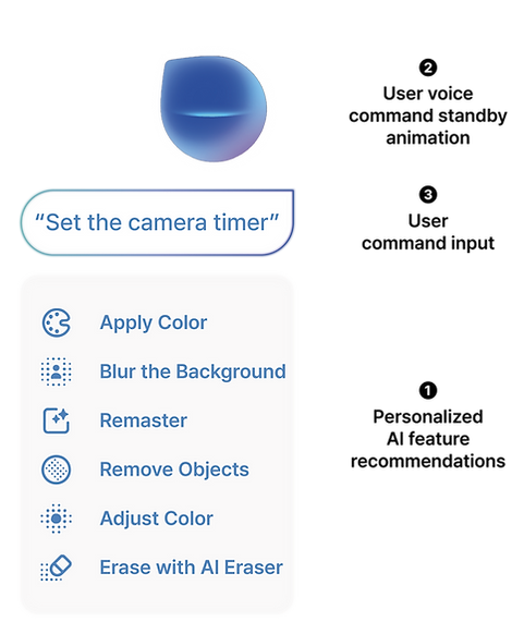
The context menu was designed to create a more intuitive and personalized AI interaction.
When Bixby is invoked, it presents context-specific AI feature recommendations based on the active application, helping users access the right tools without extra navigation. A standby animation reinforces that Bixby is always ready to listen, while the user’s voice command appears in a speech bubble interface and is executed instantly.
This flow enables interactions that feel seamless, responsive, and context-aware.
User Flow

This user flow illustrates how AI functions are invoked and adopted through different stages of user familiarity, following Rogers’ Diffusion of Innovation model.
Context-Aware Invocation: In the early awareness stage, users receive prompts such as push notifications that encourage them to explore AI features. Functions can be accessed naturally through gestures like press & hold or swipe, leading to the context menu where commands are executed via Bixby voice input or touch.
Button-Based Invocation: In the interest, evaluation, and usage stage, users interact more deliberately through a dedicated button, which ensures consistency and reliability while supporting both voice and touch-based activation.
In-App Invocation: At the adoption stage, AI functions are seamlessly integrated into the app interface as in-app icons, allowing direct and efficient touch-based activation.
By aligning these flows with stages of adoption, the design ensures that AI features are introduced gradually, helping users build habits and ultimately integrate AI into their everyday routines.
User Scenario

* The images on the scenario board were generated by AI.
This scenario illustrates the user’s journey from function awareness to interest and finally adoption of AI camera features. At each stage, users gradually learn and engage with AI-assisted functions through voice commands, push alerts, and contextual suggestions.
Bixby + AI Integration: UI Wireframe

This wireframe illustrates the system flow of AI photo assistance across different invocation methods, including Bixby integration, direct buttons, and in-app icons. It visualizes how users trigger, interact with, and receive feedback from AI functions, highlighting the seamless transition between user intent and intelligent system response.
Insights.
This project went beyond simple button design to redefine the interface structure that allows users to intuitively experience their relationship with AI.
The goal was to design a UX flow and feedback system where AI interactions feel like a process of understanding and responding to user intentions and context, rather than merely executing commands.
By integrating a physical button (PUI) as the main access point to AI, the design enabled users to discover and use AI features more naturally and effortlessly, instead of relying on complex touch or voice-based controls.
Through this process, I gained insight into how AI technology can foster trust and emotional connection through familiar physical experiences, and further developed a human-centered design approach that transforms technology-driven UX into empathetic experiences.