META XR HUB
KOREA CONFERENCE
UI Strategies to reduce cognitive load in VR experiences
Overview.
Team Project
Role
UX/UI Strategy · Syetem Diagrams · Animation ·
VR Prototype
Oct 2022- Dec 2023
Tools
Blender · Unity ·Illustration · Sketchup
This project proposes a design that lowers cognitive load in VR. While motion sickness from hardware-driven feedback delay is a technical issue, our approach mitigates its impact by helping users anticipate what comes next and by smoothing stimulus transitions.
We introduce a Six-Gateway framework to create that continuity. Rather than static icons, we use a gate metaphor, a door with a window, so users can preview and then directly enter the experience. The gate functions as the Threshold Space, seamlessly linking changes in stimuli and supporting a more immersive flow.
Design Process.
Define
Cognitive overload at entry

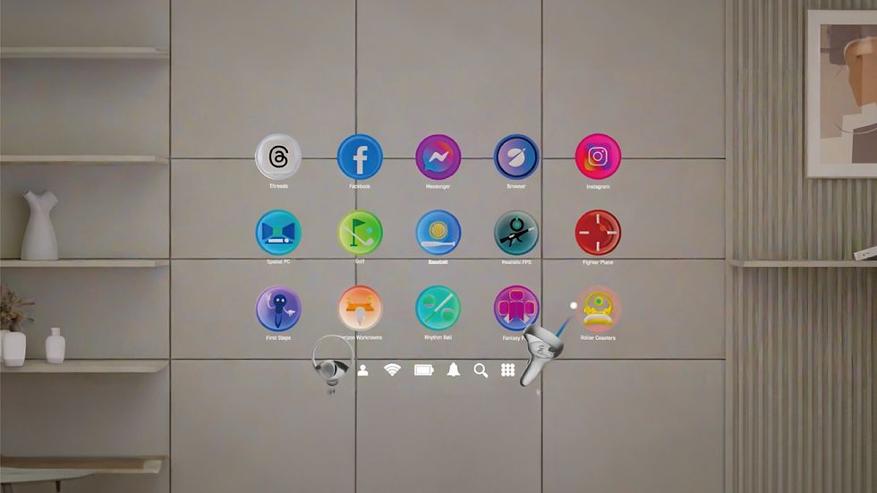
Abrupt, opaque transitions from the home menu to VR spaces create uncertainty, causing cognitive overload and motion sickness, which leads to churn.
No pre-entry cues on the home screen

Before launch, users can’t tell the locomotion/control scheme (self-directed vs. forced) or the degree of physics coherence (reality-aligned vs. divergent), slowing adaptation and raising anxiety.

In the VR environment, we examined the input–output loop between the user and the system to understand where mismatches and cognitive gaps emerge. These gaps, such as differences between user expectations and system feedback, can increase cognitive load and even contribute to motion sickness. By identifying them, we were able to develop a UI strategy that makes transitions more predictable, helping users anticipate upcoming changes and paving the way for a smoother, more immersive experience.
Goal
Preview physics and locomotion before entry to reduce cognitive load and motion sickness
Research

According to prior research, VR environments differ from the real world in terms of physical laws such as Gravity, Scale, Object, Time, and Environment. To help users adapt to these changes as they enter VR app spaces, we explored various ways in which interactions could occur within the VR home screen, where real-world physical laws are still applied.

To make the transition from the physical world to virtual app spaces feel more familiar and seamless, we conducted ideation by framing the home screen as a passthrough environment.
Since spatial movement is inherently three-dimensional, we transformed the traditional 2D menu into a 3D spherical interface. Users could rotate the sphere to select their desired app, and once selected, a new sphere containing representative objects from that app would be generated. Inside this sphere, the unique physical laws of the app were applied, allowing users to experience the transition through dynamic changes in the environment.

As another approach, we selected a specific app, identified the elements that differ from reality, and ideated possible transition methods that could occur when entering the app.

We selected Beat Saber, which is characterized by its consistently dark background, dynamic changes in scale, and a zero-gravity-like environment where objects fly toward the player.

Time
Scale
Gravity

The basic menu only displays the app’s logo. However, by applying the game’s theme colors, the icon itself begins to create a sense of connection to the game environment. In particular, when the user hovers over the icon, the color change allows them to visually experience the atmosphere of the game world even before entering the app.

Default

Typically, icons are fixed in menu. In Beat Saber, though, objects float and fly through space as if in zero gravity. Representing the icons in a floating or scattered manner lets users visually experience the sensation of a weightless environment even before the app launches.
Gravity Difference

In most cases, icons are arranged in uniform sizes. One of Beat Saber’s key characteristics, however, is the dynamic scaling of objects—growing and shrinking in size. By reflecting this, the icons can be arranged with varying scales, allowing users to experience the dynamic sense of scale even before entering the app.
Scale Difference

The default bright background of the home screen provides a neutral state. However, since Beat Saber takes place under dark stage lighting, the background shifts to a darker tone when launching the app, enhancing immersion. This temporal transition (bright → dark) allows users to smoothly adapt to the spatiotemporal atmosphere of the game.
Time Difference
Gravity
Time
Scale
Environment
Object
This experiment explored how a fixed UI might reveal changes in gravity, time, scale, environment, and objects when moving from the home screen into an app environment.
We decided to focus on gravity among the five physical laws that differ between VR and reality, since it has the greatest impact on how users move within VR experiences.
Scale
Object
Gravity
Time
Environment
Ideation prototype for home environment with gravity law
While ideating ways to apply the law of gravity in the home environment,
we realized that gravity could be categorized based on two criteria
: the user’s movement and the movement of objects.
Ideation prototype for the gravity application: user movement, object movement

To analyze the laws of gravity in more detail, we examined VR apps where gravity operates differently from reality.
By analyzing the gravity rules applied in the reviewed apps, we established the first set of criteria for classifying VR apps based on gravity. Then we organized actual VR apps and content by two main criteria: the input method and the degree of alignment with physical or gravitational responses

This resulted in a matrix that crosses four categories of movement also with three levels of physical reaction:
-
no movement from home, movement not possible with controller, movement with controller, and forced movement beyond input
-
point-and-click only, reactions similar to reality, and reactions different from reality.
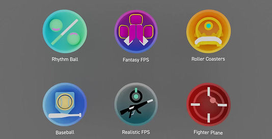
By mapping concrete examples into this structure, such as native apps, standing simulation games, military FPS, roller coaster simulations, and fantasy FPS, we were able to systematically classify VR experiences according to how their mechanics diverge from or adhere to real-world physical laws.
Portal

Portal
Preview
Background
We developed a scenario using portal that previews the in-app space along with its gravity rules, allowing users to experience the app environment through the portal and then continue with the same gravity rules applied in the background.
When a user selects an app from the menu, the environment of that app appears inside the portal, while the other app icons in the menu transform into spheres that surround the portal. As the user previews the app environment within the portal, the surrounding spherical icons respond and behave according to the gravity conditions of that specific app.
To enable portal-based interaction, we transformed the conventional 2D app icons into spherical forms. To distinguish the app currently in focus, we proposed an arrangement where icons are not laid out flat but instead move forward as they approach the center.
Unity Portal Prototype
To allow representative objects from each app to enter the gate, we modified the form into a hollow hemisphere and conducted experiments with this structure. We further developed this concept by naming the portal-based transition system a gate.

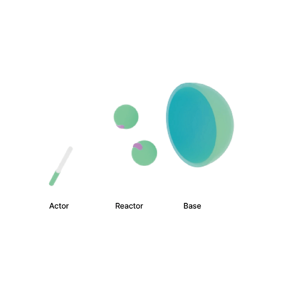
The Gate proposed as a UI element replacing the traditional icon is composed of an actor, reactor, and base. This is designed to help users immediately understand the action elements they will experience and the reactive elements they will encounter within each app. Specifically, the actor represents the object that responds to the user’s input, the reactor represents the object that reacts to the actor’s behavior, and the base serves as a background that visually conveys the characteristics of the content through color.

When selected in the Hover stage, the portal is activated, and within that "threshold space," users can gradually anticipate the rules of "actions" and "movements" of the body that will change within the content. Then, when the user grabs the "actor" in the activated portal stage, the spatial transition occurs.
Gate Structure

To integrate the gate, icons were redesigned to align their interfaces with the new interaction model, adopting an actor–reactor–base structure that makes the dynamics of action, reaction, and contextual background immediately clear to users.


We defined the sequence as Hover → Open Portal → Transition Protocol → App launch, using visual animation and spatial hand-offs to keep the flow feeling natural.
System Structure
Users can quickly distinguish whether each app offers a reality-based or surreal experience through rapid hover exploration. Next, within the “threshold space” of the activated gate,the portal, they can preview the specific form of the experience. Finally, as they enter the app through the portal, the manner of transition itself allows them to sense how their avatar’s movement will behave inside the app, making the spatial shift more intuitive.

We categorized the Hover stage, and the transition from the portal into the app according to different gravity stages.
In the Hover stage, the interaction changes depending on the color code.
-
Color code Green: Base shifts to green
-
Color code Yellow: Base shifts to yellow
-
Color code Red: Base shifts to red
-
Color code Blue: Actor and Reactor slightly move forward
-
Color code Purple: Actor and Reactor animate to reflect the app’s internal movement
Through these combinations, users can experience a total of six distinct hover effects.
Hover


Portal-App Transition


In the green-coded scenario, the user physically approaches the portal, entering the app space as the portal expands forward.
In the yellow-coded scenario, the portal itself moves toward the user, smoothly enveloping them and guiding the transition.
In the red-coded scenario, the portal defies gravity and ascends dynamically toward the user, creating a more vivid and energetic entry.
Across these variations, particles become more active and dispersed around the portal as the color transitions from green to red, visually emphasizing the increasing intensity and liveliness of the movement.
User Scenario


This flow illustrates how the system determines and executes different portal-to-app transition animations based on the user’s movement, control input, and the physical behavior of virtual content. Depending on whether the avatar’s motion aligns with the user’s body, controller, or independent physics, the system triggers one of three transition types: body-synced, controller-synced, or independent motion. Each type produces a distinct level of immersion and realism throughout the portal transition.
Implementation: Six Gateways


The "discrepancy in stimuli" is divided into the levels of "body/avatar movement" and "action," allowing users to sense these differences even during the process of exploring content. Reality-like content is categorized in blue, while content that doesn't exist in reality is categorized in purple.
When hovering over the gate, if the "action" of the content matches the user's expectations(blue), the actor and reactor slightly move forward, simply emphasizing the content, while indicating the level of risk through a color change.
If the "action" differs from the user's expectations(purple), the design allows users to anticipate the action and reaction in advance.


Each type of content is distinguished by three modes of transition, based on the interaction between the user's physical movements and the avatar's movements. The transitions are categorized as follows: “content where the body and avatar move in a 1:1 ratio (Green)”, “content where additional avatar movements occur based on controller input (Yellow)”, and “content where the avatar's movement is forced, regardless of the body or input (Red)”. The portal and avatar will respond in alignment with these modes of correspondence, and the transition sequences are designed according to these interaction types.
Transition Process

First, users can quickly navigate through hover interaction to determine whether the experience of each app is based on reality or is more surreal.
Then, within the portal, which serves as the critical space of the activated gate, users can preview the specific type of experience they will encounter.
The space transforms by reflecting the characteristics of the avatar's movements within the app.
When the user clicks the actor with a controller, a transition occurs from the gate to the app.

Insights.
This project reinterpreted the process of transitioning from a portal to an app in a VR environment as a sensory experience rather than a simple visual change. The study revealed that the synchronization between user movement and system response plays a crucial role in maintaining immersion and reducing cognitive load. Additionally, the particle flow surrounding the portal not only served as a visual effect but also created an emotional rhythm and sense of motion, enhancing users’ psychological engagement.
Through this process, I discovered that a transition should not be seen as a mere scene change, but as an act of passing through and experiencing space. As a designer, I developed the ability to connect complex system interactions into a cohesive flow of user experience. Moving forward, I plan to design personalized transition scenarios based on user data such as gaze, position, and speed to further strengthen the sense of sensory presence.
Achievements.
Patent
The hyperlink visualization system that alleviates the user's perceptual burden due to the difference in movement rules between virtual spaces and the method thereof
Jung, E., Kim, M., Kwon, J., Jeung, B., Lim,S. 2024.
Korean Patent 1020240075067.