
EARCARE
Overview.
Team Project
Role
UI Design · UX Design · User Research · Usability Testing
Oct 2021- Nov 2021
Tools
Illustration · Photoshop · Figma
EAR CARE is a mobile UI/UX design project for hearing protection designed for users who are continuously exposed to noise in everyday life but struggle to recognize or manage their own hearing condition. The project begins with the observation that existing hearing-related applications rely heavily on numerical data and therefore fail to motivate meaningful behavioral change. Instead of framing hearing loss as something to be diagnosed, EAR CARE redefines it as sensory fatigue that requires ongoing recovery and care. By tracking surrounding noise levels and exposure time and visualizing appropriate rest periods for the ears, the system helps users intuitively understand their hearing status. Through the use of avatars, tag-based systems, and community features, users are encouraged to perceive their hearing condition in emotional and social ways. Ultimately, EAR CARE proposes a user experience driven preventive healthcare interface that supports sustained and voluntary hearing care behaviors rather than relying on warning-centered approaches.
Design Process.
Define
The need for an intuitive hearing care experience in everyday noise

Unlike existing hearing-related applications that rely on numerical data and warning-based feedback, users often struggle to understand their hearing condition in a meaningful way. There is a need for a hearing care design that supports intuitive awareness and sustainable recovery within daily sound environments.
Hearing loss is perceived as a medical issue, not an everyday experience

Hearing care is commonly framed around diagnosis and risk, making it difficult for users to relate their daily listening habits to their own condition. This medicalized perspective prevents users from recognizing gradual hearing fatigue and engaging in proactive, everyday care behaviors.
Goal
Help users intuitively recognize hearing fatigue in everyday noise and engage in sustainable hearing care behaviors.
Empathize.
Main Domain
People who suffer from hearing loss.
Main Problem
Earbuds applications have no user-friendly interface, so it cannot help people who suffer from Hearing Losses.
Background
Challenging to find suitable settings only depending on listening for normal users.


Nura-phone Sound Personalizing
Samsung Galaxy Buds Pro
True Wireless Earbuds offer features like Active Noise Cancelling and Ambient Mode, which help users personalize their listening environment and even support people with mild hearing loss by making surrounding voices clearer. However, most earbuds applications still lack intuitive interfaces, visualized sound information, and flexible controls for adjusting external sound. Because users must rely only on listening, it becomes difficult to find settings that feel comfortable.
To improve this experience, we propose a UI and UX system that provides visual sound feedback and more customizable controls, allowing users to adjust Active Noise Cancelling and Ambient Mode in a clearer and more intuitive way.
Theoretical Research
HEARING LOSS

Noise Deafness
(Sudden Deafness)
Young Generation
Presbycusis
Old Generation
(Almost) Deaf
Serious Hearing Loss
Feel hard to communicate
Middle Hearing Loss
Middle Hearing Loss
Not aware of hearing loss
Light Hearing Loss
Normal
Hearing loss is divided into noise induced sudden deafness in younger people and presbycusis in older adults, and each category includes a range of conditions from light and middle hearing loss to serious or almost complete deafness.
Interviews
Symptom
Young Generation
Noise Deafness & Sudden Deafness
Light Hearing Loss
Little difficulty in talking
Old Generation
Noise Deafness & Presbycusis
Serious Hearing Loss
Feel huge difficulty in communication
Cause
Using earphone for a long time
Listening to music in high volume
Age
Using earphone for a long time
Response
Know the risk of hearing loss,
BUT cannot take the problem seriously.
Opened to using the functions of BT Earphone
Take the problem seriously
BUT think negatively about talking
with electronic device on the ears
DON’T WANT his or her hearing loss
to be known to others.
Insight

Even if they know the risk of hearing loss, They cannot recognize their own hearing condition.
It’s inappropriate to solve their problem with Application and Bluetooth Earphones
Through the interviews with 5 participants, we found that older users take hearing loss seriously but are reluctant to use apps or earphones for support, while younger users fail to recognize their condition yet actively use these devices. Based on this insight, we narrowed the second ideation focus to young users with early-stage hearing loss.
Define.
Main Domain
Young Smartphone Users who want to prevent hearing loss
Main Problem
Despite the increase of environments exposed to severe noise, it is difficult to recognize the dangerness.
Persona

Minsu Kim
Age
Hobby
Location
Playing a drum
Seoul, Korea
Uses of audio equipment
-Galaxy Budz Pro
-Use 2-3 hours
-Volume set 60-70%
-Use ambient sound, ambient
mode, noise cancelling often
Problems/Needs
-Get proper help for his hearing after being diagnosed.
-Want to know information on the usage time of Bluetooth earphones.
-Adjust the volume of surrounding sounds.
Hearing Experience
Minsu is suffering from hearing loss due to band activity experience and being exposed to the sound of speakers due to job.
He uses Youtube and Instagram through earphones even when I take a rest.
Attitude to application
He is aware of the risk of hearing loss, but he's not willing to use it to get help.
He feels alerts from applications are bothersome.
Attitude to Hearing loss
Reducing the use of audio equipment, reducing volume is the most realistic prevention I can practice.
He intentionally lowers the volume of music while playing in a band, and he uses earplugs for musicians.
Based on insights gained from interviews, this project identified young smartphone users who want to prevent hearing loss as the primary target group. Rather than focusing on assistive solutions after a diagnosis has already been made, the project concentrates on early stage users who are continuously exposed to noisy environments but fail to recognize the associated risks in their daily lives. As a result, the core problem was defined not as the severity of hearing loss itself, but as the difficulty of perceiving and recognizing its gradual onset. A preliminary persona was then developed by reflecting these users’ listening habits, device usage patterns, and attitudes toward applications, which informed the direction for designing a user centered hearing care experience.
Survey

To define the final persona, identify key domain problems, and establish a clear direction for solutions, we conducted a survey titled UI/UX Hearing Loss Status and Prevention Methods. The results showed that many users in their twenties are exposed to high levels of noise for extended periods, yet take little active action to protect their hearing. While some respondents expressed concern about potential hearing loss, most lacked clear knowledge or strategies for managing it effectively. These findings indicate that preventing hearing loss requires more than simply providing information and highlight the need for clearer, more supportive UI/UX solutions that help users understand their condition and translate awareness into action.
Persona

Jinsu Park
Uses of audio equipment
-Galaxy Budz Pro
-Use 2 hours
-Volume set 70-80%
-Use ambient sound, ambient
mode, noise cancelling often
Problems/Needs
-Has a soundproof wall or other structure to block sound when the house is near the road.
-He hopes the motorcycle roar and the bus’s engine will be a little less noisy.
-Uses earplugs or earphones to avoid loud sounds, but it disrupts the conversation and does not help enough.
Age
Occupation
Location
28
Marketing Assistant at a Digital Media Company
Seoul, Korea
Hearing Experience
Exposure to living noises is more than 3 hours.
Try to take a rest, avoiding the loud sound.
Attitude to application
Easy to access.
Feel the necessity of application for hearing loss prevention.
Refined Noise cancelling technology.
Attitude to Hearing loss
Sometimes feel dangerness of hearing loss through ear symptoms.
Not interested in hearing loss and prevention usually.
Long time using audio equipments with the high volume is the most concened cause for hearing loss.
The lack of rest time for ears seems to be the main cause of hearing loss.
Main Domain
Young smartphone users who want to prevent hearing loss
Main Problem
There are applications that can help people to check their hearing habit and show exposure to the hearing loss, but it does not motivate people to be careful.
Solution
Instead of helping them to change their hearing habits, let users have sufficient rest time for the ear which is the best way to prevent hearing loss.
Ideas
Help users to spend some time in a quiet space.
Use stopwatch to help users to spend enough time.
Measure the surrounding sound, and if it’s quiet enough,
help users to relax without audio equipment
Based on earlier research, this project defined young smartphone users who want to prevent hearing loss as the primary domain. Although these users already have access to applications that track listening habits, a key problem was identified in that warning messages and numerical data alone do not lead to meaningful behavioral change.
In response, the project established a solution direction centered not on immediately correcting listening habits, but on supporting one of the most fundamental conditions for hearing protection: sufficient rest for the ears. The goal is to help users recognize quiet environments and naturally secure moments away from noise, reframing hearing protection as an experience that can be practiced within everyday life.
Design.
1st Prototype
Sketch


Before creating the low-fidelity prototype, team members individually developed and shared initial sketches based on their interpretations of the problem and proposed solutions. The sketches explored multiple approaches to key features such as the main screen, detailed information views, warning messages, and hearing assessments. Through this sharing process, the team compared different strategies including data- and graph-driven presentations, state representation using color and form, and interactions that clearly distinguish rest time from noise exposure. These discussions helped define core screen structures and information priorities, which informed the key interactions and user flows implemented in the low-fidelity prototype.
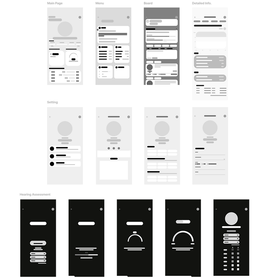
Low Fidelity Prototype
Detailed Information


Main Page
Sub Main Screen

Show Noise
& Rest Record
Main Screen

Red: Loud Noise
Blue: Rest Time
Warning Message

Send a message if users
are exposed to loud noise excessively


Hearing Assessment


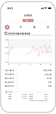
The first prototype visualizes users’ daily noise exposure and required rest time through intuitive charts, risk indicators, and warning messages. It includes a detailed information view that breaks down noise patterns over time, and a hearing-test feature that helps users track and understand their hearing levels. This version focuses on translating complex auditory data into simple, actionable feedback for safer listening habits.
User Test

KEY PAIN POINTS
- The Records of this app is not enough to motivate users.
-There is no system that can make actual change & treatment.
- It’s difficult for normal people to meaningfully interpret the provided information.
- Numerical information should be ADDITIONAL!
IMPROVEMENT PLAN
1. Avatar & Tag System
- Motivate users to understand their hearing status in detail.
- Provide information in an intuitive way through tag recommendations.
2. Online Community System
- Communicate with other users who share the same tag.
- Understand the cause of symptoms through reliable diagnosis by a medical specialist.
User testing revealed that record- and number-based information alone was insufficient to motivate behavioral change and was difficult for general users to interpret intuitively. While warning messages and listening records raised awareness, they rarely led to actual rest or hearing care actions.
In response, the project repositioned numerical data as a secondary element and introduced avatar and tag systems to support intuitive understanding of hearing status. A community feature was also added to enable communication with users and experts sharing similar tags, guiding users toward meaningful understanding and behavioral change through an experience-centered approach.
2nd Prototype
Low Fidelity Prototype
Main Page
Avatar Character that represents the current noise level


A sub-screen that
shows the noise level record


A bar graph showing the right amount of time to recover your ears
TAGs that represents the
User’s symptoms & characteristics


User Tag Setting
Avatar Customizing
Personal Info.


Community
Hearing Assessment
Communicate with users
who share the same TAG


Compare the hearing status with people who share the same tag

Gather opinions from
experts related to tags


Get level by hearing assessment and also record the score
The second prototype expands the first version by introducing a more personalized and engaging experience. An avatar visually reflects the user’s current noise exposure level, while customizable tags represent the user’s symptoms and lifestyle characteristics. The system also adds social features, allowing users to communicate with others who share similar tags and compare their hearing status within these groups. The hearing assessment is upgraded to provide user levels and recorded history, creating a more holistic and community-based hearing-care platform.
User Test
Jung OO
It seems to be helpful to change my habits for hearing. Since it informs what certain decibel for how long I am exposed to. And since such information is informed through the app, it can help me to avoid some noises(ex. Listening to music loudly) that can be prevented.
Also, it seems to be highly utilized in that it does not only provides numerical information but also it grades my hearing level and allows me to share concerns with people who have similar hearing level as mine.
For the posting part, as it is possible to post questions and look over the expert opinions at the same time, it looks very practical. Whenever I had any questions, I had to use Naver search engine, and as information is scattered, it was hard to solve it, but this app provides all the information, I would really like to try this application.
Lee OO
The tag concept seems to be very useful. It would be good to understand my hearing status by collecting tags, and it would be convenient to share information with people suffering from similar symptoms. With avatars, there’s no particular function related to hearing, but I like it because it’s better to represent the user’s characteristic more intuitively than tag. In that sense, it would be nice to show user’s profile who posted the questions. So, it’s fun to have an avatar since it’s less boring.
It would be also nice to automatically recommend the tag when writing a post. Since the user is not an expert, application can analyze the post and recommend proper tags.
And there are ‘representative tags’ and also the ‘interest tag’. I don’t know how exactly they can used differently but I just understood ‘interest tag’ as a tag I searched for myself.
Lee OO
For the people who are using this app for the first time, it’s little difficult to understand this application’s overall functions. As you explained all of the functions in detail, I could follow up, but if I was alone and come across the application, I wouldn’t figure out how to use this well. So, it might be better if the design can provide the guidance of these functions at one.
However, each functions seems to be fully utilized.
Kim OO
I’m not sure whether I’ll use it often or not, but right now, I think I will. In the detailed information, it would be better to show daily, monthly, yearly information. It is so nice that it’s possible to see doctor’s posts independently.
And I think it might be better to modify hearing test. Rather than showing just one record in the beginning part, it would be more helpful to show three or five records more. And during the hearing test, I was confused of the method of pressing the screen when I can’t hear the sound. Unconsciously I was touching the screen. So, it would be better to make additional button or something else. For the test result, it’s little unclear. I was wondering if darker part means good hearing ability and lighter part means bad ability. I hope it shows result more specifically.
It seems the tag is mixed little randomly. I suggest to set category and classify colors according to the categorization. Then it will be easier to find tags user want.
KEY PAIN POINTS
- The main screen looks cluttered.
- It’s difficult to understand this application’s overall functions. Users need some guidance of these functions at one.
- The difference between the use of the “representative tag” and the “interest tag” is unclear.
- In the detailed information, users want to show daily, monthly, yearly information.
- Recommended TAGs are listed without regularity.
IMPROVEMENT PLAN
1. Delete < Representative Tag > section of the main page.
2. Change MENU design
- Change the menu design so that we can check “the overall information” at once.
- It will be a guidance of the functions.
3. Delete ‘Interest Tag’
4. Separate TAG types with colors
5. Add ‘daily’, ‘weekly’, ‘monthly’, ‘yearly’ options in Detailed Information View.
User testing conducted before the final iteration revealed that the main screen was too information-dense, making it difficult to understand the overall functionality at a glance. It also showed confusion around the tag structure and menu system, causing users to misinterpret the roles of different features.
Based on these findings, unnecessary tag elements were removed and the menu structure was reorganized to clarify core functions. Tag types were differentiated through color and categorization, and time-based filters were added to the detailed view, leading to a more interpretable and refined final prototype.
Iteration.
Wireframe
The low-fidelity prototype was created to explore the overall structure and navigation of the application before defining visual style or detailed interactions. At this stage, the focus was on organizing key screens and understanding how users move between the main page, hearing assessment, community board, and detailed information views.
By simplifying interface elements into grayscale layouts, the prototype allowed for quick iteration on information hierarchy, content grouping, and assessment flow. This process helped clarify which information should be presented upfront and which details could be accessed progressively in later stages of the design.
Mood Board/Branding
Primary & State Colors
Support / Data / Text Colors
.png)
Earcare’s branding tone is defined through a clear hierarchy of primary, state, and supporting colors, creating a cohesive visual language across the interface. These colors are applied consistently to core UI components such as avatars, icons, buttons, and tags, reinforcing a hearing care experience that feels calm while enabling immediate recognition and response.
High Fidelity
MAIN PAGE
Safe
Caution
Danger
Recovery
Color states visualize auditory fatigue and recovery

Board
Details
Test
Settings


Learn
Reflect
Check
Personalize
Menu
Gain context through
experts and community
See patterns in
exposure and recovery
Assess hearing
through simple tests
Adapt care to your lifestyle
Together, these stages extend Earcare beyond monitoring, guiding users from understanding to reflection and long term care through learning, testing, personalization, and visualized recovery data.
SECONDARY PAGES
From Awareness to Action
Overview
