EarCare
Designed a mobile hearing care interface that helps users recognize auditory fatigue more intuitively and build sustainable preventive habits beyond warning based data.
Type
Team Project
Tools
Figma, Illustrator, Photoshop
Timeframe
Oct - Nov 2023
Role
Product Designer
Problem
Existing hearing care apps show risk, but they rarely help users feel when they need care

The need for an intuitive hearing care experience in everyday noise
Unlike existing hearing-related applications that rely on numerical data and warning-based feedback, users often struggle to understand their hearing condition in a meaningful way. There is a need for a hearing care design that supports intuitive awareness and sustainable recovery within daily sound environments.

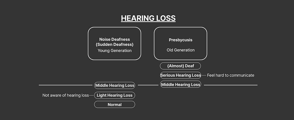
Hearing loss is perceived as a medical issue, not an everyday experience
Hearing care is commonly framed around diagnosis and risk, making it difficult for users to relate their daily listening habits to their own condition. This medicalized perspective prevents users from recognizing gradual hearing fatigue and engaging in proactive, everyday care behaviors.
Solution
Introducing EarCare
A mobile hearing care experience that reframes hearing loss prevention as everyday recovery rather than diagnosis. Instead of focusing only on warnings or raw numbers, EarCare helps users understand their hearing condition through recovery time, intuitive states, visual feedback, and community based support. The goal is to make prevention feel more personal, understandable, and sustainable.

Primary Research
Interviews revealed that people know hearing loss is risky, but often cannot recognize their own condition
I interviewed 5 participants and found a clear split between older and younger users. Older users tended to take hearing loss seriously but were reluctant to use apps or earphones for support, while younger users actively used audio devices yet struggled to recognize the seriousness of their own hearing condition. Across both groups, participants understood hearing loss as a risk, but had difficulty connecting daily habits to gradual auditory fatigue. This led the project to focus on younger users in early stage prevention rather than post diagnosis support.
“I know loud sound is bad for my ears, but I usually do not notice a problem until they already feel tired.”
A survey of young users revealed a clear gap between noise exposure and preventive action
To validate the final target user and define the opportunity area more clearly, we conducted a survey with 15 users in their twenties. The survey showed that young users are regularly exposed to harmful sound but rarely translate awareness into preventive behavior.
57%
are exposed to noise for more than 3 hours a day
64%
take no action to avoid noise
9%
actively take time to rest their ears
Secondary Research
Hearing care is often framed as a medical condition, not as an everyday sensory experience
The early research reviewed hearing loss categories, noise induced risk, and everyday listening behavior. This showed that hearing care is commonly presented through diagnosis, severity, and caution, which makes it hard for users to relate their daily sound exposure to their own condition. The project reframed the issue from hearing loss as a medical event to hearing fatigue as an everyday state that requires rest, recovery, and ongoing care.
Competitive Analysis
Current earbuds and hearing apps provide controls, but not intuitive understanding
I reviewed tools such as NuraPhone and Samsung Galaxy Buds Pro, which offer sound personalization, active noise cancelling, and ambient mode. While these products help users adjust their listening environment, they still rely largely on hearing alone and provide limited visual support for understanding what is happening. This revealed an opportunity to design not just better listening controls, but a hearing care interface that helps users interpret their auditory condition more clearly and connect awareness to action.

Design Goals
1. Make hearing fatigue easier
to feel
Translate abstract noise exposure into more intuitive visual states, recovery cues, and simple patterns users can understand at a glance.
2. Encourage sustainable preventive habit
Shift the experience from warning users about risk to helping them actively rest their ears and care for their hearing over time.
3. Personalized Care
Use avatars, tags, and shared spaces to help users understand their own condition and learn from people with similar experiences.
Persona
Focusing on a young user who is regularly exposed to noise but does not yet take hearing care seriously
Focusing on a young user who is regularly exposed to noise but does not yet take hearing care seriously

Jinsu Park is a 28-year-old marketing assistant in Seoul who is frequently exposed to noise through commuting, city living, and regular earphone use. He listens with Galaxy Buds Pro for about two hours a day, often at high volume, and uses ambient mode or noise cancelling depending on his environment. While he sometimes notices signs of auditory fatigue, he rarely connects them to a need for consistent prevention. He is open to hearing care support, but only if it feels easy to understand, quick to access, and relevant to everyday life.
“I know hearing loss is a risk, but I do not really think about it until my ears start to feel uncomfortable.”
Frustrations / Pain Points
• Everyday noise exposure feels unavoidable
• Current coping methods like turning down the volume or using earphones do not feel enough
• Hearing loss still feels like a distant problem rather than an urgent one
• Preventive actions are easy to overlook in daily routines
• Needs a clearer way to recognize when his ears need rest
Prototypings & User Testings
1st Protytype & User Test
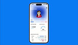
The resulting first prototype translated daily noise exposure and required rest time into charts, risk indicators, and warning messages, with a detailed information view and a hearing-test feature. At this stage, the system still centered numerical information and monitoring.

"Awareness alone did not lead to action!"
Participants found the information difficult to interpret intuitively, and while warning messages and listening records raised awareness, they rarely led to actual rest or hearing-care actions. The project also identified four core pain points: records were not motivating enough, there was no mechanism for actual behavior change or treatment, general users struggled to interpret the information meaningfully, and numerical information needed to become secondary rather than central.

Tracking hearing risk
Supporting intuitive care
This round of user test led our team to reposition numerical data as supporting information rather than the center of the experience. The new direction introduced an avatar and tag system to help users understand their hearing status more intuitively, and a community feature so users could communicate with others who shared similar symptoms or concerns. In other words, the project moved from monitoring to care, and from warning to behavioral support.
2nd Protytype & User Test
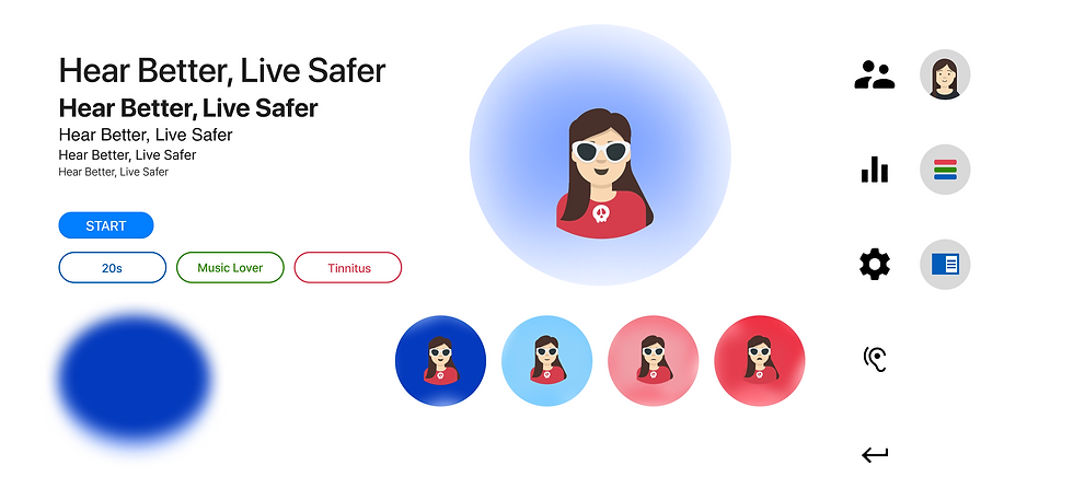
The second low-fidelity prototype introduced an avatar character that represented the current noise level, tags that expressed the user’s symptoms and characteristics, a community section for communicating with users who shared the same tags, and a more developed hearing assessment. This version made the system feel more personal and emotionally legible, while also helping users interpret their condition through a combination of self-representation and shared experience.

"Main screen is cluttered and the tag structure is difficult to understand!"
Users responded positively to the tag system and community-based support, but they also found the main screen cluttered and the tag structure difficult to understand. They wanted clearer guidance for first-time use, more regular organization of recommended tags, and time-based filters such as daily, monthly, and yearly views in the detailed information section. Based on this, unnecessary tag elements were removed, the menu structure was reorganized, tags were differentiated through color and categorization, and the detailed views were refined.
Design System
Designing a hearing care experience that feels supportive, personal, and easy to understand
EarCare was designed to make hearing care feel approachable, clear, and emotionally understandable. Calm blue tones represent trust, safety, and recovery, while warmer alert colors indicate caution and danger when hearing fatigue increases. Rounded icons, simple typography, and avatar based feedback help translate abstract auditory data into a more personal and intuitive experience.
By combining clear state colors with a friendly visual identity, the interface supports both awareness and action. The system helps users quickly understand their hearing condition while making prevention feel less intimidating and more sustainable in everyday life.
Wireframe
The final wireframe clarified the information hierarchy before visual refinement
After the second round of testing, the final wireframe focused on simplifying the structure of the app. It clarified the relationship between the main page, hearing assessment, community, and detailed information, while making the overall navigation more interpretable at a glance. This step helped translate the earlier testing feedback into a cleaner and more coherent product structure before moving into the final interface.

Final Outcome
EarCare helps users move from awareness to action through recovery, reflection, and care
Takeaways
EarCare shows that preventive health design works better when people can feel their condition, not just measure it
This project shifted hearing care from a warning centered model to a more intuitive and recovery focused experience. Through two prototype rounds and user testing, the design evolved from charts and alerts into a broader system that used states, avatars, tags, assessments, and community support to help users understand and respond to auditory fatigue more meaningfully.
For preventive health, awareness alone is not enough. Users need interfaces that help them interpret their condition in ways that feel immediate, understandable, and personally relevant. EarCare suggests that behavioral change becomes more likely when health information is translated into intuitive experiences rather than left as numbers and warnings.
A next step would be to strengthen onboarding and simplify the first time experience so users can understand the full system more quickly. The concept could also grow into a richer preventive health platform by refining how recommendations, assessment results, and recovery guidance adapt over time to each user’s listening environment and habits.